So far, I’ve mostly been using graphical techniques to directly compare two players at a time across a range of yardages, and have been using tables for when I want to compare a lot of players at a time for specific yardage cutoffs.
But it is actually possible to look at how a lot of players compare to one another across a range of yardages in graphical form. We just need to combine two of the ideas I introduced in chapter 1: density plots, and quartiles.
 "As you may remember, "percentiles" are the names for the values that are at least as great as some percentage of other values. So, for example, a 10-yard run is approximately the "90th percentile" because about 90% of other runs were less than that. A -1 yard run was about the 10th percentile, because only 10% of runs were less than that (i.e. led to a bigger loss). "Quartiles" is the special name for the values that divide all the data into quarters: the 1st quartile is the 25th percentile, the 2nd quartile is the 50th percentile (the median), and the 3rd quartile is the 75th percentile."
Easy enough, right? And of course, you remember density plots:
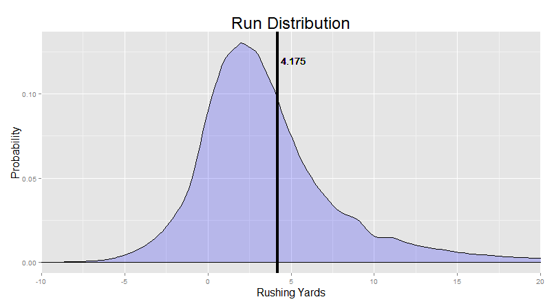
Now, we got this by just looking up all the runs for the past six seasons and calculating which proportion of runs went for each of the yardage gains. So, about 12.5% of runs over these seasons went for about 3 yards etc. This approach just doesn’t even care who did the running. All players were included, and we didn’t keep track of how they differed.
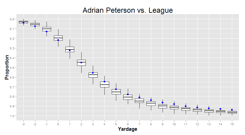
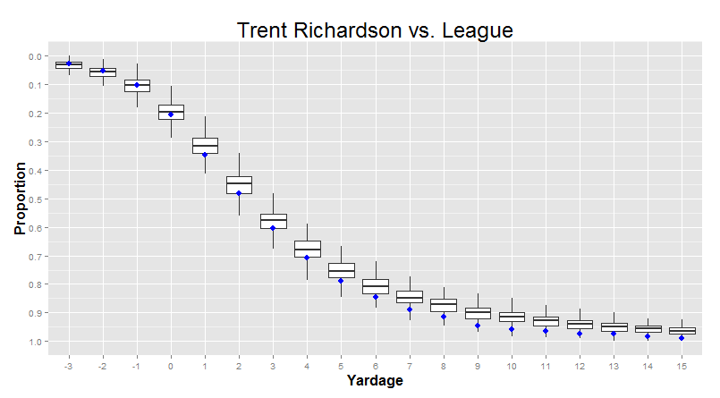
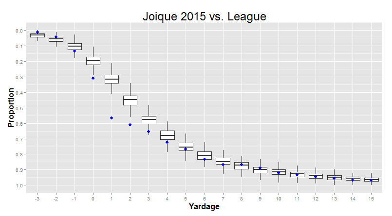
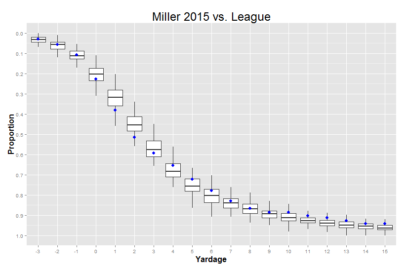
But we can, if we want to. Let’s say we make one of these density plots for each individual player over 50 carries (so we don’t get the bizarro shapes). Then, we go yard by yard, and calculate the quartiles for the proportions for that yardage gain. This sounds complicated, but it’s actually pretty intuitive: Adrian Peterson makes a lot of 10-yard runs, Trent Richardson makes barely any 10-yard runs, and most other players are somewhere in between. The quartiles are just an indicator of how big those differences are - where the 25th percentile is (probably around TRich levels) and where the 75th percentile is (probably around AP levels).
That looks something like this:
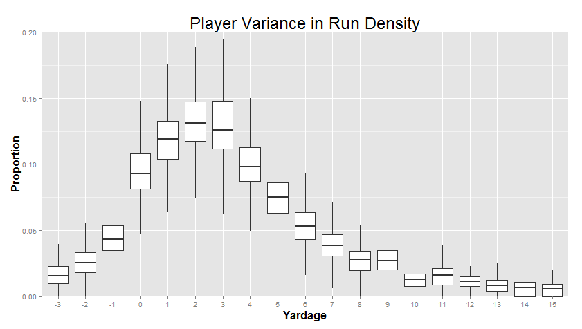
"This is called a 'Box Plot'. The line in the middle of each of the boxes is the median (or 50th percentile) for that yardage. The top of the box is the 3rd quartile (the 75th percentile) and the bottom of the box is the 1st quartile (the 25th percentile). Bigger boxes mean more variance between players. The "whiskers" also mean something, so I left them on for folks that have seen this sort of thing before, but you can safely ignore them if you want."
Right away, you can see that the big differences between players are in the 0-5 yard range, with smaller differences between players at the extremes. In particular, we can see that variance really shrinks when the proportion of runs that go that distance is very small. For example, a person is typically only tackled for a 3-yard loss like 1%-2% of the time. When the average is so low, there’s not a lot of room for players to differ - it’s not like you can really go much lower than that! There’s a hard limit - a “wall” - at 0%. These sort of “wall effects” are actually pretty common.
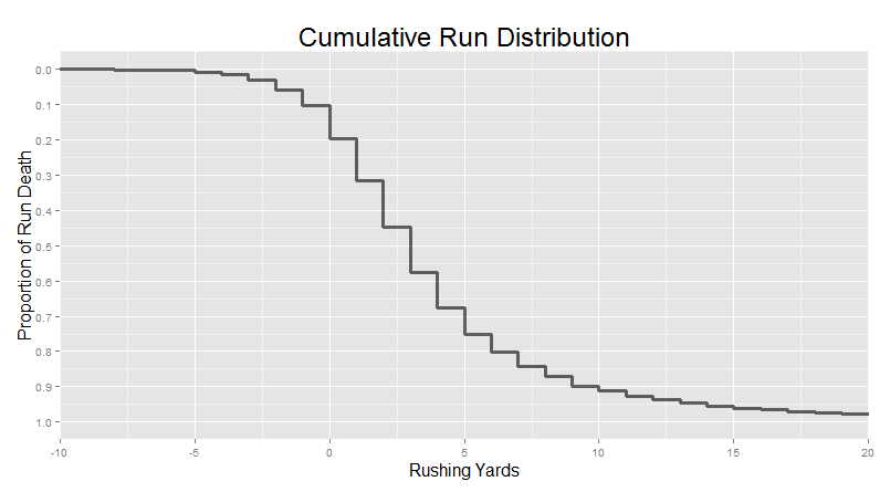
The cumulative distribution shows this as well, but it’s not quite as bad. Remember, our basic cumulative distribution looked like this:
And if we turn this into a boxplot, we get this:
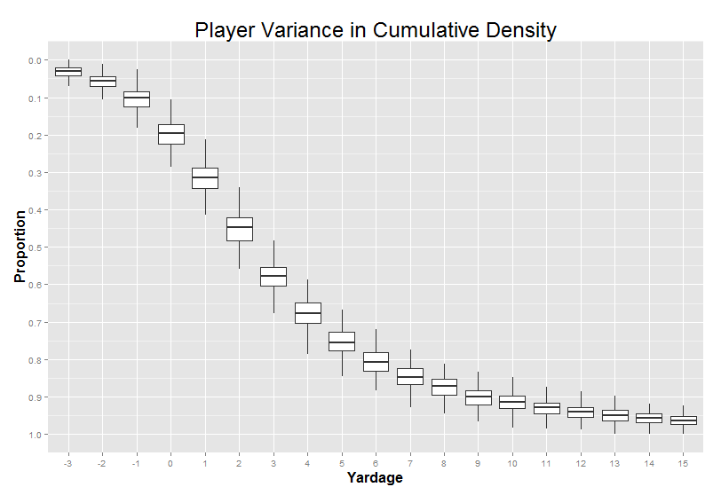
Again, we can see the most variance between players around 0-6 yards.
So what’s the point of all this? Well, in chapter 3, we asked our player matcher machine to find the players with the “closest” cumulative density curves. I used all of the player-to-player variance between -3 and 15 yards as the scope of where it should minimize the distance between the lines. But because players differed from each other the most in this 0-6 yard range, this part of the curve was significantly more important than the other parts of the graph when the algorithm is deciding who to match up. That’s not some deep truth about football (other than the fact that “player-by-player differences tend to be biggest in this typical 1-5 yardage range”), it’s just how we happened to program the algorithm. We’ll come back to this in a later quick hit.
But in the meantime, there’s also one last thing we can do with this kind of visualization. I can show you one single player, compared to these averages, in a way that lets you easily incorporate the fact that the variance from player to player changes depending on where you’re looking: