- What’s in a game?
- What are the chances?
- Whole-Game Probability
- Introducing Surprisal
- Game Surprisal
- Game Score: The Final Evolution
- Is it sticky?
- CHAPTER SUMMARY
What’s in a game?
In chapter 4, we explored the unreliability of small sample sizes. But football is a weekly game, and we often find ourselves in a position of trying to ask ourselves “what did we learn this week?”, or trying to arbitrate whether such and such player had a “good game” or a “bad game”. There’s a mismatch between what we currently can measure and what we want to measure. It’s a tough problem.
This chapter, we’re going to take our shot at inventing some new football metrics to tackle that problem. We’re going to find an inuitive way to describe game-by-game performance in a single, reliable value.
 "Clearly, Yards Per Carry is not the statistic that we want. YPC isn't even reliable from year to year much less game to game. As we showed in chapter 4, YPC is very sensitive to random fluctuations. Maybe you bust out a long run, maybe you don't. And that has a big influence on YPC at small, game-sized samples."
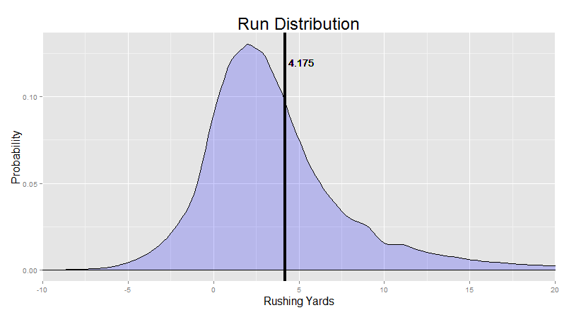
To be fair, all those nifty visualizations we developed we’ve been focusing on are all equally garbage at small samples too. You end up with all sorts of weird, uninformative shapes. For example, take this one from David Johnson:
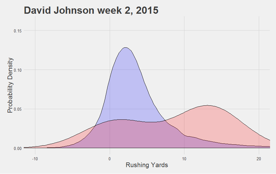
Looks impressive. But do we REALLY mean to imply that David Johnson was more likely to get a 10-yard run this game than a 5-yard run?
"And we aren't saved by our usual refrain that we're just 'describing what happened in the past' rather than 'trying to predict what would happen given more carries'. David Johnson didn't have any carries of 5 or 10 yards this game. The visual summary is a bad one."
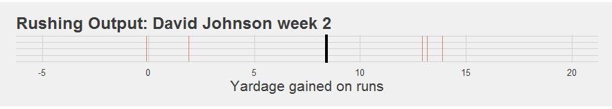
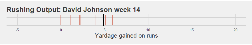
It’s really not much better than saying his “average YPC was 8.4” or that “his median run was 13 yards”. The summary just isn’t that good at conveying what actually happened during the game. We might have an intuition that this particular set of five runs was “good”, but how good was it? And our intuitions get harder as we start to approach the 15, 20, or 25 carry range (where a summary is supposed to get more useful). For example, how much better was this game:
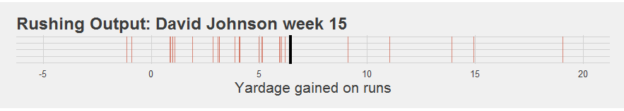
Than this game:
Overall, YPC is overly-sensitive to fluky long runs and isn’t actually predictive, and our usual visualizations are unreliable and clunky at small samples and hard to compare across games with different numbers of carries.
Basically, we have a hefty set of challanges to overcome if we want to develop a better summary. A good summary statistic will need to:
- Handle the “long run problem” elegantly.
- Allow a person to compare games with different numbers of carries intuitively.
- Be relatively “sticky” from game to game or year to year (indicating that it is actually picking out a reliable signal of “player quality”, rather than mostly just picking up on noise).
"Fortunately, these are solvable problems. And I've got the perfect place to start."
What are the chances?
"Recall that back in chapter 1, we introduced the idea of runs as being a part of a probability distribution. It's what motivated our density plots. This is a tremendously powerful idea, because if each run is part of a probability distribution, then each distance has a probability."
We implicitly took advantage of this feature for our resampling procedures in chapter 4. There, we randomly sampled runs from various players or from the league average in order to learn more about the role of chance in the run game. Hidden behind that process was a key feature: the chances of randomly sampling, say, a five yard run has a probability equal to the proportion of five yard runs in the numbers we were sampling from. It’s like rolling a hundred-sided dice, where the probability of any particular outcome is determined by how often that outcome has happened in the 80,000 or so rolls of the dice we’ve observed in the past.
Let’s say that we want to find the probability of getting exactly a 5-yard run (no more, no less). We just go look and see how often a 5-yard run occurred in the past.
"That's easy enough. In the seven seasons since 2010, there's been 6,139 5-yard runs by a running back, out of 82,524 attempts. 6139/82524 = 0.0744, or about 7.5% of all runs. In fact, let me do this for the first 10 yards from the line of scrimmage."
| Yardage | Proportion of all Rushing Attempts |
|---|---|
| 1 | 12.0% |
| 2 | 13.3% |
| 3 | 12.5% |
| 4 | 10.1% |
| 5 | 7.4% |
| 6 | 5.3% |
| 7 | 3.9% |
| 8 | 2.9% |
| 9 | 2.7% |
| 10 | 1.3% |
But we run into a bit of a problem here: the data gets really sparse for longer runs. For example, in the past seven years, a 72-yard run has occurred only twice: Ronnie Hillman in week 4 of 2015, and C.J. Prosise in week 11 of 2016. That’s at least 5 years in a row where nobody ran exactly 72 yards at all. Would we really want say that the probability of getting a 72-yard run in those 5 years was exactly 0.0? That because it hadn’t happened, it was impossible? That can’t be right.
"There's a related point that nearby yardages happen to have more runs than that. Four people in that time have run 71 yards, and five have run 69 yards. Do we really want to estimate that these are twice as likely as 72-yard runs?. "
Probably not. The small sample problem rears its ugly head again: small samples lead to unreliable estimates. In this case, we don’t have enough data to estimate the probability of a 72-yard run by just taking the proportion of 72-yard runs over the last seven years. So how do we get around this?
"Well, we're currently treating each of these run probabilities as completely independent. But that doesn't seem right at all. Rather than assuming that a 72-yard run has some probability that is compeltely distinct from the probability of a 71-yard run, we can instead make the opposite assumption: that the probability of getting a 72-yard run is likely to be closely related to the probability of getting a 71 or a 73-yard run, or even a 69 or 75-yard run."
In fact, it wouldn’t be too weird for a statistician to assume that the rate of even something like 10-yard runs might tell you something about the probability of getting a 72-yard run. This is essentially what we do every time we draw a trendline through some data: we assume that making the line fit right for the 10-yard range should influence how the line gets drawn for the 70-yard range.
"This is called 'parameterization', where we define our estimation by specifying properties (or parameters) of the line like 'slope' and 'intercept'. There are similar ways to define the parameters of a probability distribution, like estimating the shape parameters of a Beta distribution (try plugging in 2.5 and 10 - look familiar?)."
Parameterizing this problem - discovering an equation that governs how likelihood of all run probabilities - is the ideal outcome. But parameterization is really hard, and requires some assumptions we would rather not make at the moment (though we do have some intuitions here we will pursue at some point). For our first attempt today, we just want the data to speak for itself, using the rule that “the probability of any given run should also reflect our estimation of the probability of similar runs”. That’s all.
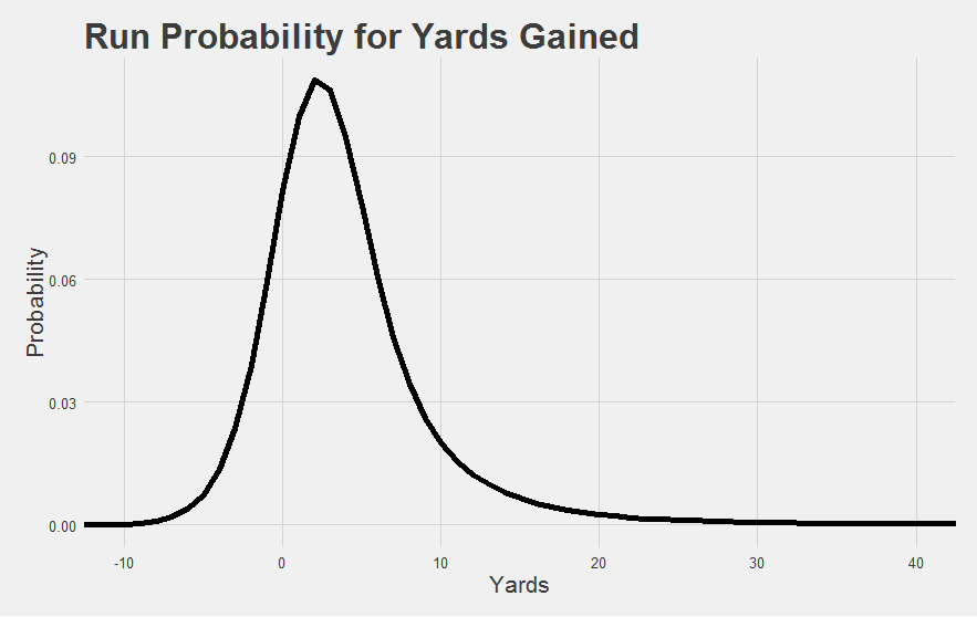
"No problem. In fact, we've already done this in chapter 1. We called it 'smoothing over the histogram' in order to get the run distributions we know and love. We were sneaky and left it at that. But what we actually did is something called 'kernal density estimation' (KDE for short)."
KDE sounds complicated, but it’s really not. Basically, we take each data point, and turn it into a tiny little bell curve. This is like saying “that 70-yard run could easily been a 69 or 71-yard run, and maybe even could have been a 65 or 75-yard run” etc. And then, we just stack all those little bell curves on top of one another. The end result is a nice, smooth distribution. You should check out the visualizations here to see the process in action.
"The end result should already be familiar to you:"
This smoothing process gives us much more stable estimates of probability for those pesky long runs, because now, our guess for the probability of a 72-yard run gets an assist from the data we have on 71, 73, 70, 72, 69, and 73 yard runs (etc. etc.).
And now that we have a probability estimate for every single run length, we can put them to use.
Why thinking in probabilities solves the long run problem
So how much “better” is a 20-yard run compared to a 10-yard run? A 10-yard run compared to an 8-yard run? “Yards per carry” simply assumes that all yards are created equal. A 20-yard run is worth twice as much as a 10-yard run, and the difference between 50-yard and 40-yard runs is the same as the difference between a 10-yard and a 0-yard run. This is what gives us the long run problem: a 50-yard run is better than a 10 yard run, sure, but is it five times better? Because that’s how much it increases the YPC stat by. And that’s why YPC is unreliable at the game level.
"This is a tough problem that a lot of smart, creative folks have found ways to address. And they all begin by finding an alternative to the "all yards are created equal" rule. The most common approach is the "expected points added" method. Here, folks build a model of situational factors much like we did last time in chapter 5, but make the "expected points" of that situation as the outcome instead of rushing yardage. For example, maybe the situation of starting a 1st and 10 on the opp 30 has an expected points of around 4 (I made this number up but bear with me). Most teams that find themselves in that situation will probably eventually kick a field goal on the possession, and a few others will probably score a touchdown. The average over all those different outcomes (weighted by how often they occur) is maybe around 4. By looking at the expected points of the situation before and after a run (say you start from a 1st and 10 on OPP 30 and end at a 2nd and 5 from OPP 25), you get a measure of how much the run improved the team's current situation (in units of expected points scored)."
Brian Burke did some initial important work on this back at his old site, and it has since been further developed by folks like ESPN, FootballPerspective, and fantasy sites like Numberfire (see also similar work by Rotoviz).
A cool feature of these EPA measures is that it accounts for the “leverage” of any particular play on the game’s outcome. A 5-yard run on a 2nd and 4 is “worth” more than a 5-yard run on a 2nd and 6, because the former gains a first down and the latter doesn’t. This is a feature, not a bug: even though the “difficulty” of running five yards might be pretty similar in both cases, the former really does help the team more than the latter.
This approach handles the long run problem as a side effect of this “leverage” consideration: after a 1st down has been gained, the only other difference you can make on subsequent yardage is better field position before getting tackled. With a few exceptions, those first 10 yards are more essential than the other yards.
"However, because it isn't really as sensitive to "run difficulty" as it could be, it actually doesn't appear to be any better at distinguish good runners from bad ones. YPC is notoriously unstable from year to year, and a whole team's EPA per play isn't any more stable than yards per carry. EPA measures have their uses, but it's not quite what we're looking for in this case."
Our approach solves the long run problem in a different way. Instead of turning runs into EPA, we turn yardages into probabilities using the process described above. Instead of asking “how far did he go” (YPC) or “how valuable was the play” (EPA), we can ask “how likely was the run”.
This handles the long run problem really well, because 40-yard runs aren’t that much more improbable than 30-yard runs - their probabilities will actually be fairly similar. We know this because the rate of 30 yard runs has been similar in the past to the rate of 40 yard runs. If 40-yard runs were vastly more difficult, they should be vastly more rare than 30 yard runs. But they aren’t. The long run problem is solved because probability differences naturally get smaller as runs get longer. The difference between a 50-yard run and a 40-yard run is smaller than the difference between a 20-yard run and a 10-yard run, and way smaller than the difference between a 12-yard run and a 2-yard run. Thinking in probabilities actually reflects how common it is to gain any particular yardage value, on average.
Many of you might be wondering why EPA adjusts for the situation while we don’t. Seems like the smart thing to do, right? Well, it actually turns out that we could. Thinking in probability is not mutually exclusive with adjusting for the situation factors, like we did in chapter 5. While this estimation above is a decent enough at capturing how hard it is to run for any given distance in a league-average situation, we could almost certainly improve our probability estimations by adjusting for situational factors in this way. But for now, let’s keep it simple and continue assuming a league-average circumstance. Before we really go overboard with the bells and whistles, we want to make sure the engine is humming.
"One other thing to note here is that really bad runs are also improbable. Losing 10 yards on a running play is freakishly bad. But right now, this has the same probability as a 45-yard run. A stat isn't very good if it doesn't distinguish a play that looses 10 yards from a play that gains 45. That actually sounds like a significantly worse statistic than YPC, if you can believe it."
We can fix this by only assigning discrete probabilities for runs that are at least as good as the most probable run of about 2 yards. That gives us something like this:
And then for now, we lump can everything else into a “mediocre or worse run” category. About a third of all runs happen to belong to this category. Think of it this way: runs that are improbably bad would help us answer “how bad” type questions. But we’re interested in “how good” type questions right now, so we simplify our handling of the bad runs in order to better answer the “how good” question. This becomes another simplification we can come back and complicate later if things look promising.
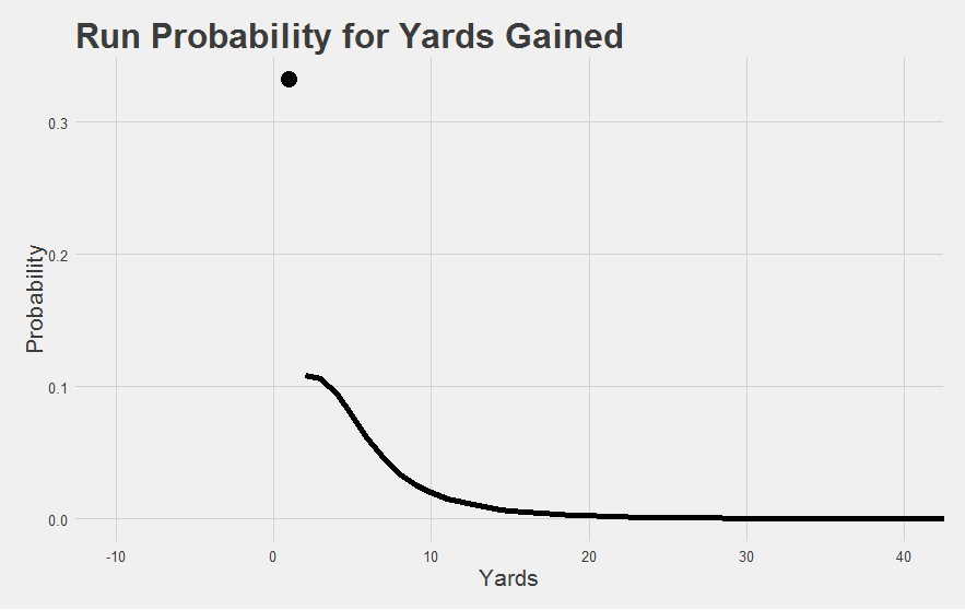
The dot at the top is the group of mediocre runs.
Equipped with this model of “how good is any given run”, we can now move on to the next step: “how good is any given game?”.
Whole-Game Probability
So we have a set of runs in a game, and we can slap a probability on each of those runs, but now we want to put them all together into a single value for the whole game. That means combining probabilities. Fortunately, probabilities combine in a really natural way.
Let’s say I roll a dice twice. Maybe I rolled a “2” and a “6”, and now I want to find the probability of having arrived at that outcome (this is comparable to having a running back take 2 carries for 2 and 6 yards, and we want to calculate the probability of having that game given those 2 carries). Well, that’s easy: the probability of rolling a 2 on the first dice is 1/6, and the probability of rolling 6 on the second dice is 1/6. The probability of rolling a 2 and then a 6 is determined by just multiplying the probabilities together, so 1/6 x 1/6 = 1/36.
" BUT! What if order doesn't matter to me. I could have just as easily gotten a 6 on the first dice and a 2 on the second dice: the combination is identical. In the end, I still have a 2 and a 6. If order matters (e.g. [2,6] is different from [6,2]), we call the set a 'permutation'. If order doesn't matter (e.g. [2,6] is the same outcome as [6,2]), we call it a 'combination'. Since I don't really care what order a player made their runs in, let's use the latter. (See here if confused about combinations vs permutations.)"
So the probability of each permutation is 1/36, and there are 2 possible permutations ([2,6] and [6,2]), therefore the probability of the combination [2,6] is 1/36 + 1/36 = 2/36.
"We're going to use that exact same process on the games from each of our running backs. Only, the dice we've created has a hundred sides (one for each possible run distance), it might have been rolled 30 times or more (once for each carry), and we factor in that each outcome has a unique probability value, and we do this for every game by every running back since 2010. Piece of cake! Hope you like math."
This process gets us to our first major milestone: Game Probability. For any given game, we find the probability of that combination of runs (given the probability estimations for each run we did above).
"For the math nerds: we have taken a short cut by using the multinomial distribution to derive the probability of the particular yardage counts obtained for each player-game."
This Game Probability metric is already pretty interesting before we even get fancy with it. For instance, the ‘most improbable games of this decade’ list is actually a pretty good mix of impressive performances. It’s not necessarily the games with the most yards, or the most carries, or the highest yards per carry etc. It’s its own thing.
| Rank | Game | Carries | YPC |
|---|---|---|---|
| 1 | DeMarco Murray_2011_w7 | 25 | 10.1 |
| 2 | Doug Martin_2012_w9 | 25 | 10.0 |
| 3 | Jamaal Charles_2012_w16 | 22 | 10.3 |
| 4 | Jay Ajayi_2016_w7 | 29 | 7.4 |
| 5 | Chris Johnson_2011_w12 | 23 | 8.3 |
| 6 | Doug Martin_2015_w11 | 27 | 8.7 |
| 7 | Arian Foster_2010_w1 | 33 | 7.0 |
| 8 | Carlos Hyde_2016_w14 | 17 | 11.4 |
| 9 | Justin Forsett_2014_w12 | 22 | 8.3 |
| 10 | Knowshon Moreno_2010_w13 | 23 | 7 |
Murray and Martin’s record-breaking games are at the top of “most improbable games”, of course. But Le’Veon Bell’s 236-yard game against Buffalo doesn’t make the top 10 - those 38 carries included a fair share of grinding out short yardage. So this Game Probability isn’t simply picking up on total yardage. Efficiency matters too.
But efficiency isn’t everything. Sort the games from the past few years by YPC and you’ll see a bunch of 1- and 2-carry games with freak long runs. The top game-level YPC in the past seven years is Jorvorskie Lane in week 1 of 2014 taking a single carry 54 yards. Most analysts try to get around this by setting some kind of arbitrary cutoff - YPC for games with 10 carries, or 15, or 20. We don’t need any cutoffs to get reasonable things here. Game Probability just works. It picked out the ultra-efficient games by Carlos Hyde and Jamaal Charles, as well as the high-carry high-yardage games by Arian Foster and Jay Ajayi, and it found them buried alongside the Jonas Gray 38-carry games as well as the Antone Smith low-carry ultra-efficient flukes.
We didn’t list the actual probabilities here because they all involve immensely small values with more than a dozen zeros, which isn’t really all that intuitive of a number to look at. One thing that became apparent pretty quickly is that when a running back takes a lot of carries (e.g. when we roll that 100-sided dice a large number of times), there are so many possible combinations that any specific combination of runs isn’t going to be very likely, and the probabilities get small enough that it begins to be hard to see and intuitively grapple with.
We show you that “intuitiveness” problem below. We’ve found the probability of each game over the past 7 years, and plotted those game probabilities against the number of carries in those games (we’re showing the trendline for the averages instead of each individual data point).
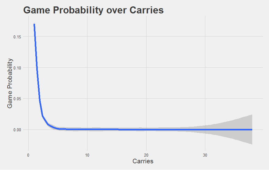
A probability of 0.01 compared to 0.0000000001 is certainly a really big and important difference (the former is 100,000,000 times more likely to occur than the latter). It’s just hard to see that difference, or really understand it at an intuitive level. Think of it this way: a bacterial cell is smaller than an ant, but an atom is way smaller still. While we’re good at imagining the difference between a cell and an ant (mostly because the cell is basically invisible to our eyes), we’re not good at imagining the difference between an ant and an atom (or a cell and an atom, for that matter). Our sense of scale isn’t appropriate for that comparison.
We can still talk about each of these inside a scale that makes sense to us, of course. We might talk about ants on the scale of centimeters, and atoms on the scale of picometers (a trillionth of a meter), but it doesn’t make much sense to talk about ants on the scale of picometers.
"What we need is a scale that works well across many orders of magnitude. That can flexibly support the difference between an ant, a cell, and an atom."
Introducing Surprisal
Brief detour. Back in the 40s, 50s, and 60s, a bunch of smart folks faced a related problem. They were trying to tackle the issue of how to describe mathematically how information is communicated. They called their field “Information Theory”. And they had a few intuitions to start from.
Let’s say you flip a coin, but I’m sitting over in my own house and I don’t know what the outcome is. Now let’s say you do get ‘heads’. You call me up and say “yo, it’s heads”. Now I know what it is. You’ve communicated to me the result of a coin flip.
Simple, right? Well, there’s something else going on here. Importantly, I know ahead of time that you’re flipping a coin. I’m not going in with no information. Because I know how coins work, I know that there is a 50% probability of heads and a 50% probability of tails. When you call to tell me the outcome, what you’re essentially doing is moving my belief about the coin flip result from 50% “heads” to 100% “heads”. The amount of information you’re giving me is whatever is necessary to change my beliefs exactly that much.
But let’s say that I had actually believed that your friend had given you a trick coin that lands on “heads” only 10% of the time. When you call me up and tell me it’s heads, it’s a lot more surprising, even though the action is the same and the message you gave me was the same. What was different is what I believed the probability of heads to be. Saying “yo, it’s heads” conveys more information when I think there’s only a 10% chance of being heads than when I think there’s a 50% chance of being heads - the former is more of a shift in my pre-existing beliefs.
"In other words, he already has some information, it's just probabilistic information about potential outcomes. He's not going in blind. Landing on 'heads' isn't going to be mind-blowing when he's already a 50% believer in 'heads' before the coin is even flipped. But it's more surprising when there's a 10% chance."
This was the primary intuition of these communication researchers: the amount of information conveyed by an event is proportional to what the receiver already believes about the probability of that event.
"Let's say we put our knowledge into a computer. A single coin flip can be represented by a single bit, which is either a 1 (heads) or 0 (tails). When we think heads and tails are equally likely, we have no preference betewen 1 and 0 - maybe we just pick one at random to start with. When you tell us what it is, we know for sure that it is a 1. In essence, your communication has moved our knowledge from complete indifference about the value of that bit to complete commitment about the value of that bit. In other words, we would say you conveyed one bit if information. In this conceptualization, a "bit" isn't just a thing in your computer codes. It's a unit of information, in the same way that inches is a unit of distance."
Now let’s say that after you call me, your friend also calls me. He was there for the coin flip too. He says “yo, it’s heads”. Well, by this point, I already know it’s “heads”. Even though his message is exactly the same as yours, describing exactly the same event, it conveys no information at all because I already know the answer with certainty. I mean, unless I think you’re a liar. In which case you telling me “yo, it’s heads” doesn’t change my mind as much as if I had heard it from a more reliable source. Essentially, what I believe matters.
Next, let’s say you flip three coins instead of one. I know you’re flipping three coins, but I don’t know the outcomes. I can represent this with three binary digits (one for each coin), where I am indifferent about whether they should be 1s (heads) or 0s (tails). When you call me up and tell me the sequence, you’re conveying three bits of information, because now I have complete information about the value of those bits where before I had complete indifference.
Low-probability events are surprising, so we call this measure of information “surprisal”.
"If we want to, we can still use surprisal, measured in bits of information, even when we're not flipping coins. Rolling a single 8-sided dice also conveys 3 bits of information (because there are 8 possible solutions, just like there are 8 possible permutations of 3 coin flips). Drawing a card out of a shuffled deck and telling me the suit conveys 2 bits of information (because I know that if there are no jokers, there are only 4 equal possibilities)."
The nice thing about surprisal is that it scales really well. Telling me a letter of the alphabet conveys about 4.7 bits of information. Telling me the results of 10 consecutive coin flips (any single permutation of which has only a 1/1024 chance of occurring) conveys 10 bits of information. Telling me you won the powerball lottery (where your chances are about 1 in 292 million) conveys about 28 bits of information.
"And the interpretation is intuitive across all these vast probability differences. Each 1 bit increase reflects something that is twice as unlikely (i.e. half as probable). 1 bit reflects something with a 1/2 chance, while 2 bits reflects something with a 1/4 chance. 3 bits conveys something that had a 1/8 chance of occurring, or half of 1/4. Similarly, an event with 10 bits of surprisal is twice as likely as something with 11 bits of surprisal etc."
This is easy to calculate. The formula is pretty simple: to find the number of bits we need to express a low-probability idea, we just take the log of base 2, like so:
Surprisal sounds like exactly what we are looking for. It takes our beliefs about the probability of an event, which we have already with our Game Probability metric, and turns it into bits of information, where each 1 unit increase in surprisal describes an event exactly twice as unlikely. It exploits our prior knowledge of what the probability of any given run is. And it scales well across many orders of magnitude, because it’s basically a simple log transformation.
"I think I have BINGO."
Game Surprisal
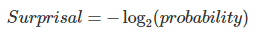
Running our Game Probabilities through that simple Surprisal conversion lets us change this:
into this:
"Much better."
Let’s recap how we got here. We think we know what the typical run distribution looks like already. Any given run can be expressed in terms of how probable that run was given this distribution. We can combine the probabilities of these individual runs into a Game Probability. Then, we can convert this into Game Probability into Game Surprisal, because the game expresses to us the outcome of events with “known” probabilities. Higher Game Surprisal values indicate games that were more improbably good (i.e. more surprising), in units of bits. A 1 bit increase means that the game was twice as improbable.
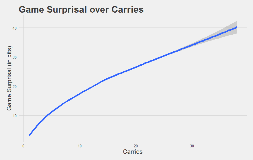
There’s one last minor adjustment we need to make before this is ready for primetime. Specifically, only good running backs ever really get an opportunity to carry the ball 20+ or 30+ times in a game. We want to normalize this “typical Surprisal” curve to express what a typical running back would score given that many carries. We can use the same principles we used in chapter 4 to achieve this.
"Ha! 'Minor', he says! While I sat here and simulated fifteen thousand league-average games for each possible number of carries between 1 and 40. That's nearly five hundred million carries!"
Finally, at long last, we have our metric.
Number of carries is along the x-axis, and Game Surprisal is along the y-axis. The gray dots reflect every game had by every individual running back in every season since 2010. The blue line shows the expected Game Surprisal for a league-average running back given that meany carries. Think of it as an “average” game given that many carries.
Without further ado, let’s dive in.
Does Game Surprisal pass the eye test?
As usual with a new metric, we’re going to want to make sure it’s giving us values that seem reasonable.
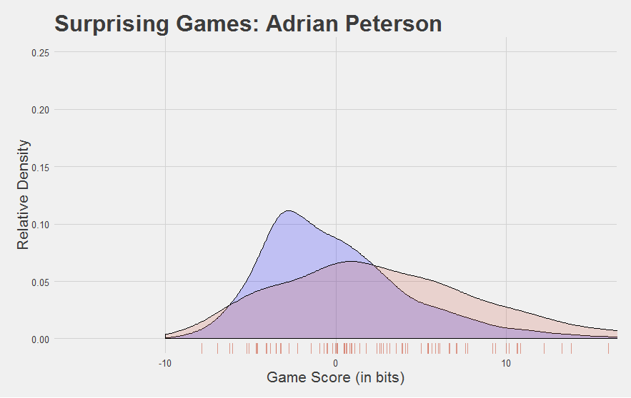
For starters, do good players look good?
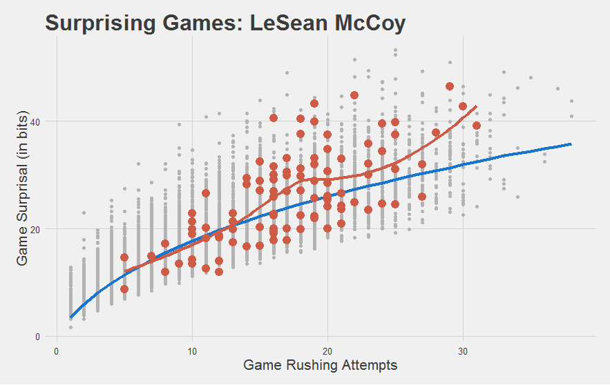
Yeah that checks out. McCoy’s games since 2010 are highlighted in red, with a red trendline running through them. As you can see, his game performances have been mostly above-average.
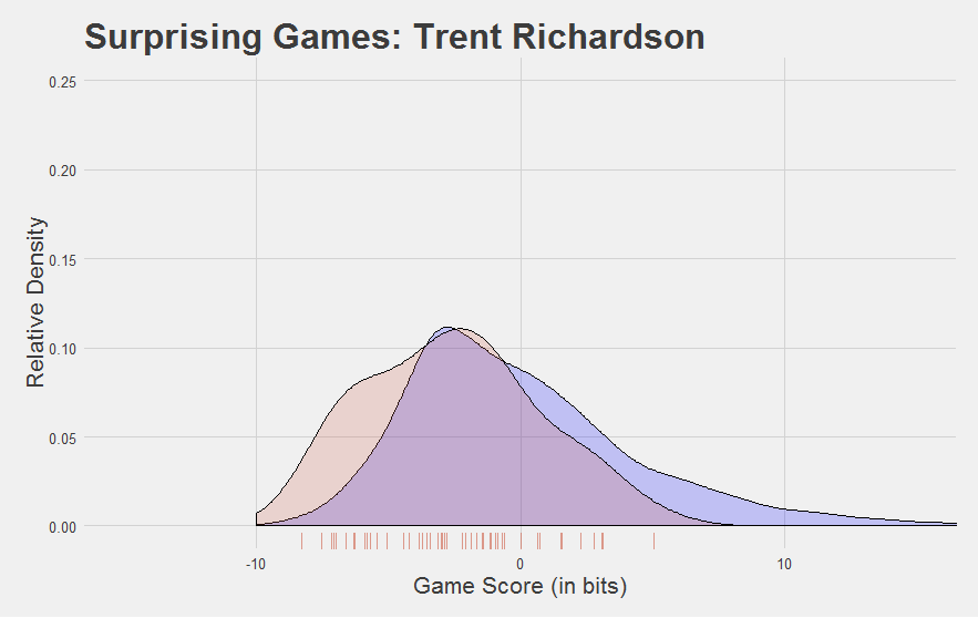
But do bad players look bad?
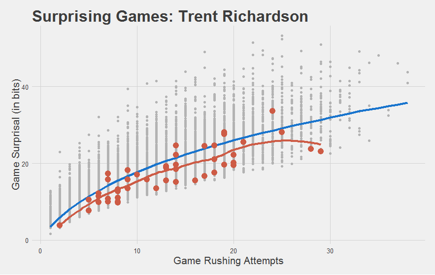
You bet they do. Nearly every game TRich ever had was below-average. Even his so-called “good” year.
"Seriously, guys. We knew."
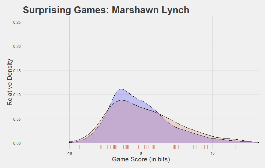
And do solid-but-not-great players look solid-but-not-great?
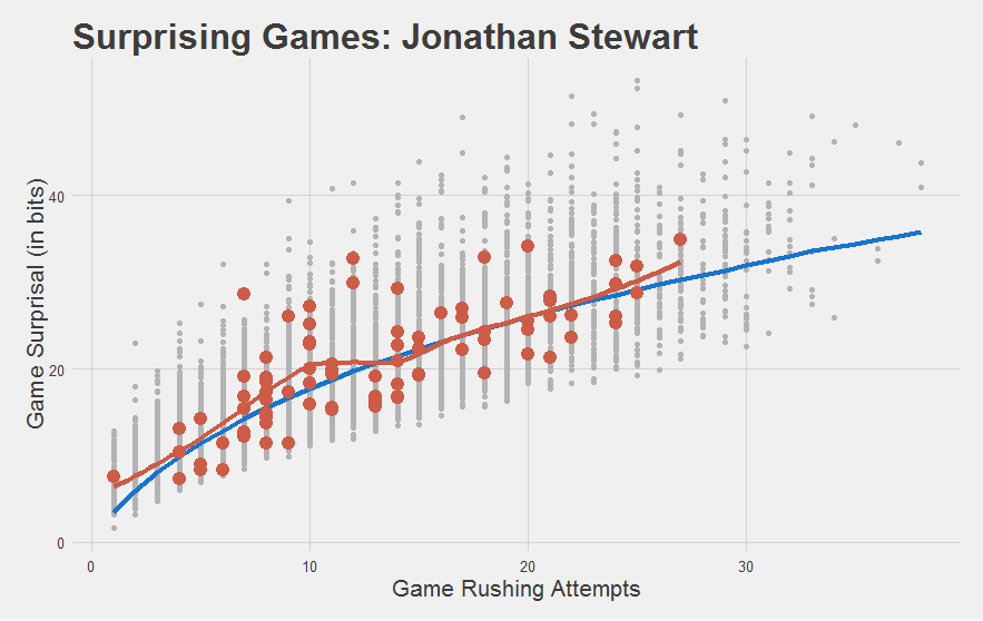
Yeah I’d say so.
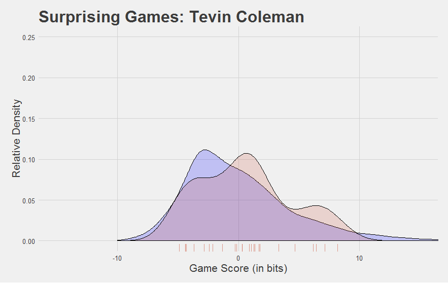
It also meets our intuitions of how the rookies did:
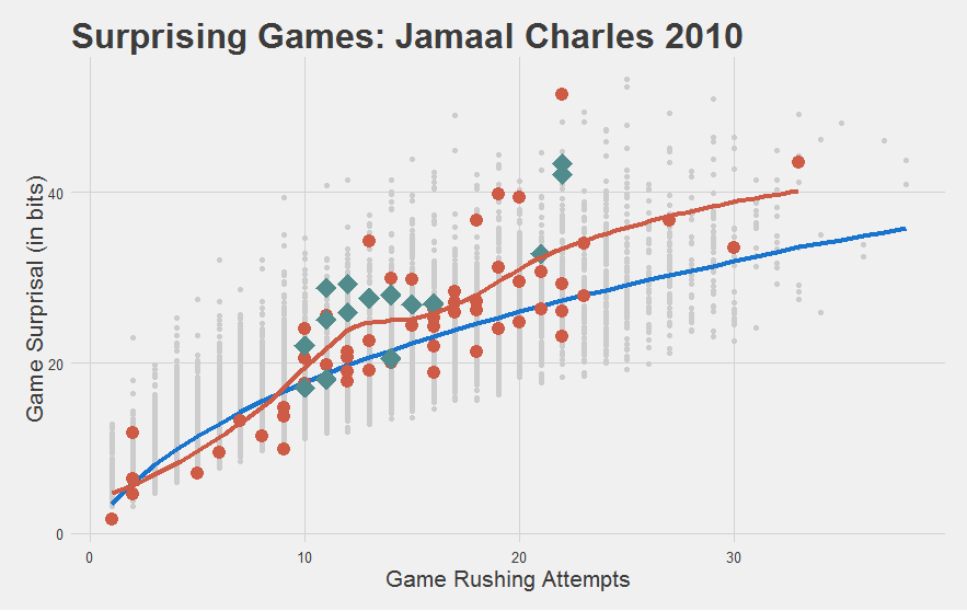
"Most importantly, we have yet another statistic to capture how stupefyingly astonishing Jamaal Charles is."
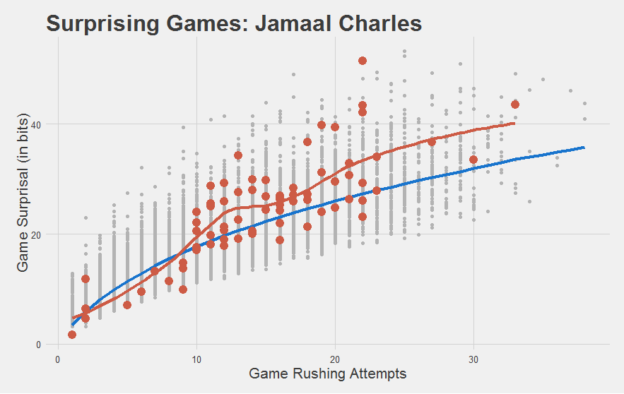
"I mean, just look at his 2010 year. Nearly every game was a home fucking run! This shouldn't be possible."
Exploring with Game Surprisal
Game Surprisal can also reveal some new things that may be a surprise to some.
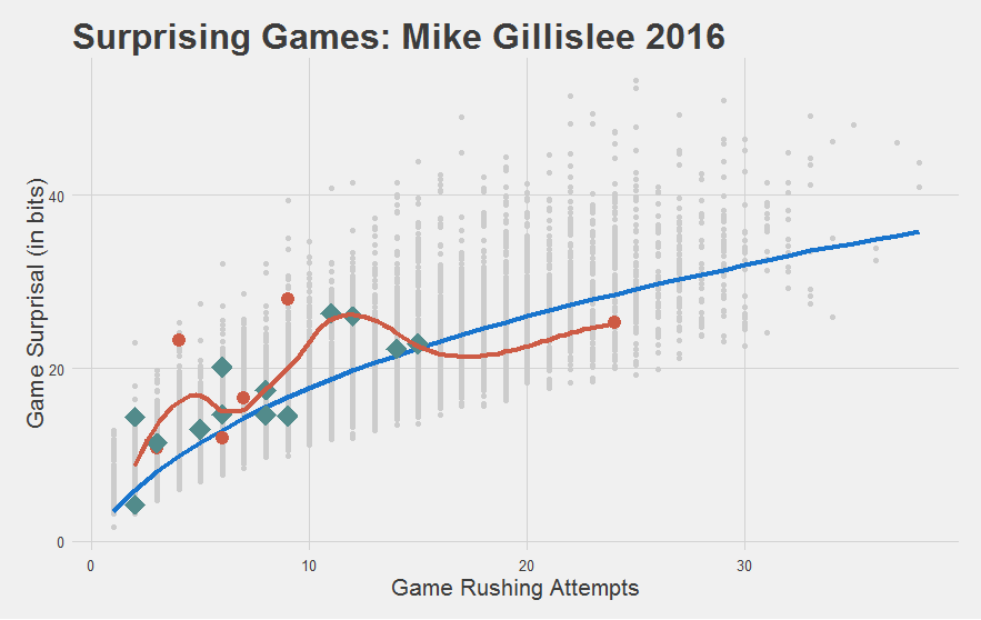
For instance, Mike Gillislee has been really impressive with his limited carries. Patriots could be making a smart pickup here.
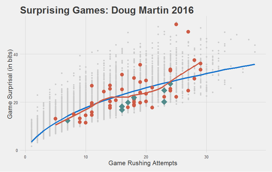
While Doug Martin might be done.
"Or in the very least, had a pretty significant off-year."
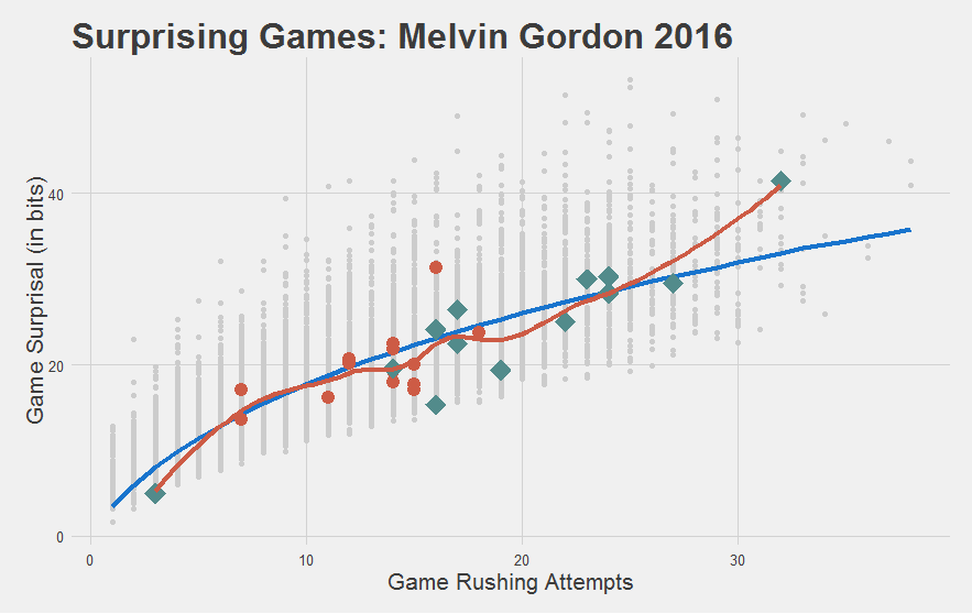
And that Melvin Gordon step forward in his Sophomore year? Turns out he’s not really running any better, he’s just running more.
We’re just scratching the surface here. We encourage you to poke around more on your own here.
Game Score: The Final Evolution
Game Surprisal is looking pretty good, but it does have one problem. We set out to make a replacement for YPC that works for small sample sizes. YPC is a rate stat, or an efficiency metric. But Game Surprisal is sensitive to both volume and efficiency. Efficient games tend to have higher surprisal scores, but so do high-volume games (the further to the right we are on the plot, the higher the Game Surprisal values tend to be).
"This is a consequence of the shear number of possibilities that could occur given a high number of carries. When somebody gets the ball 30 times, every outcome is improbable, on average."
But our ultimate goal today is to develop an efficiency stat that is actually useful. Something that is mostly volume-independent.
You might have noticed that a common focus above is comparing the player’s Game Surprisal values against the average. We did this by comparing the red dots (the games) to the blue line (the “average” game).
"We would call this the 'marginal' surprisal scores, or the element of player performance that is not explained by (i.e. different from) the league-average."
This “marginal Game Surprisal” was our way of mentally adjusting for the number of carries in that game. Well, we can go ahead and make that intuition an overt one. To get our efficiency stat, we’re going to subtract the leage-average Game Surprisal (the blue line) from each actual Game Surprisal to get a Marginal Game Surprisal. We call this a Game Score. This adjusts for number of carries, leaving us with an efficiency statistic. Because Game Score is still measured in bits, it still has a relatively intuitive interpretation. A Game Score of 0 is average. A Game Score of 1 is twice as improbable as the average. A game score of 10 is about a thousand times more improbable than average (see discussion above on bits of information).
"For the math nerds, here's the complete calculation of Game Score, starting from the very beginning. Because it's slightly intimidating, we'll hide it behind a button (by now, you should have a sense of how it is derived already - this is just a formality)."

Game Score is not sensitive to volume. Because of that, when we want to plot Game Scores for a player, we’ll collapse over carries and just show you the distribution of Game Scores (i.e. how much above or below average that player tends to be). To give you a comparison for any particular player, we’ll find the Game Score of all the gray dots on the plots above (i.e. every game by every player in the database) and plot that distribution. This will give you a sense of how variable those game scores tend to be on either side of that average of 0.
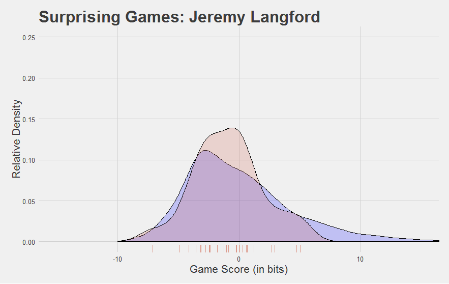
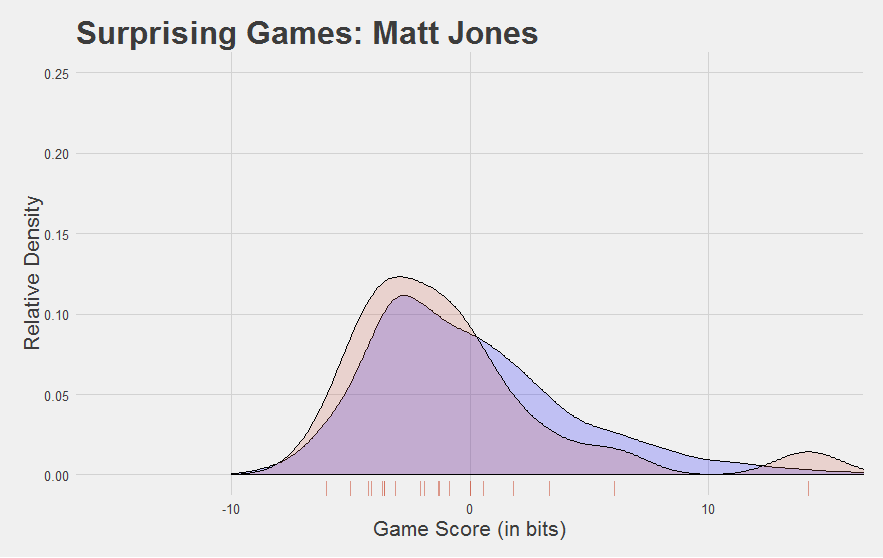
"Enough chitchat, here's some Jamaal Fuckin Charles"
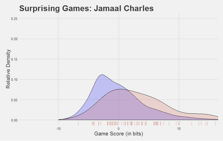
The league as a whole is in blue. Jamaal Charles is in red. Individual Game Scores from Jamaal Charles are shown on the “rug” along the bottom. Scores higher than 0 are above-average games. Verdict: Jamaal Charles is really good.
You know who isn’t?
Here are a few other interesting Game Score plots.
Now, we developed Game Score to reflect performance at the game level. Looking at the plots above, you might be asking yourself, “can you find a player’s average Game Score?”
"Hell yeah we can. Here are the players with at least 100 carries since 2010 with the highest average Game Scores."
| Rank | Player | Average Game Score |
|---|---|---|
| 1 | Jordan Howard | 3.84 |
| 2 | Jamaal Charles | 3.19 |
| 3 | Mike Gillislee | 3.18 |
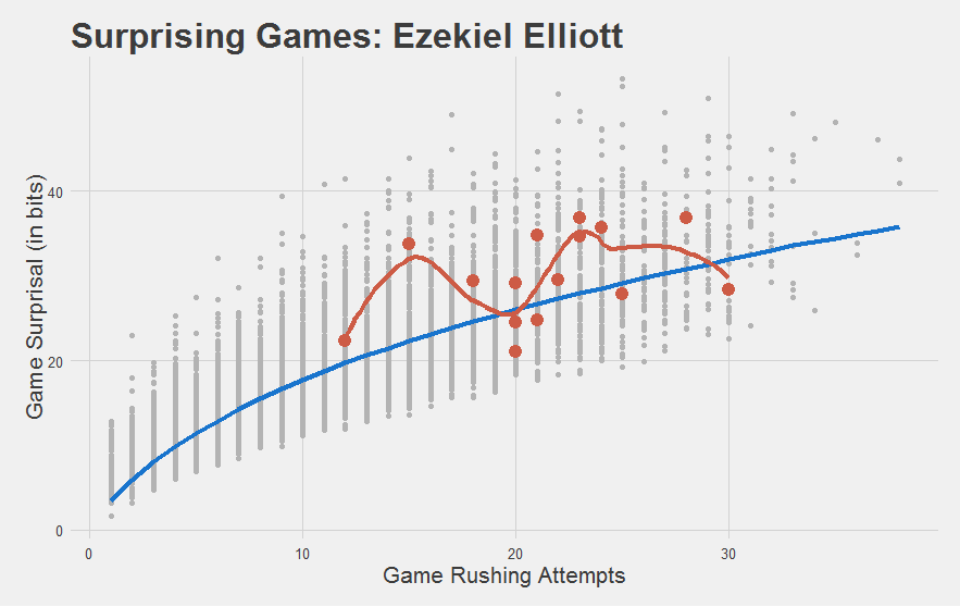
| 4 | Ezekiel Elliott | 3.15 |
| 5 | Adrian Peterson | 2.75 |
| 6 | LeSean McCoy | 2.38 |
| 7 | Jay Ajayi | 1.84 |
| 8 | Mike Goodson | 1.55 |
| 9 | Thomas Rawls | 1.49 |
| 10 | DeMarco Murray | 1.47 |
…Mike Goodson?
"Couple hundred-yard games and a bunch of low-carry hyper-efficient games as a backup. Finished his career with 167 carries. Dunno what you want me to tell ya - he's the kind of guy that Game Score likes. Most of his games were improbable."
This raises a good point. Just how reliable is Game Score anyways if taking the average game score of a player can give us a guy like Mike Goodson in the top 10? This is all very pretty, but is it actually any better than yards per carry at picking out the good players?
"Well THAT is an empirical question. So let's put it to the test."
Is it sticky?
A key indicator that YPC isn’t particularly meaningful is that it is notoriously unstable. It swings wildly from week to week and even from year to year for any given team or player. Part of this is just typical football chaos: the universe of potential outcomes for each play is vast, and trying to predict one over the other is a tall order. But part of it is the poor metric, as we described in the beginning of this chapter.
We want to see if our Game Score metric is any better. Specifically, we want to know if Game Score is more stable from year to year than other efficiency metrics.
"The first order of business is combining these weekly Game Score values into a single value for the whole year. Above, we simply took the average, regardless of how many games the player had or how different the number of carries was in each game. This is an exceedingly dumb approach. It would be smarter to weight the high-volume games more than the low-volume games: they carry more signal and less noise."
It might be dumb, but it is simple, so let’s start there.
"OK, done. But in order to show the dumbness here, I'll calculate a yards per carry stat that same way - first finding weekly YPC, then taking the average over weeks. We can compare this to the 'typical' YPC (where each carry is worth the same amount at the end of the year) to show that it is in fact even worse."
And then we need to define our player sample. Clearly, to check year-to-year stability, we need to look at players that have played at least two consecutive years since 2010. Some analysts who have done this in the past have restricted it only to players that were also on the same team in those two years.
"Lemme guess. We're doing the dumb way again."
Look, if we really believe that Game Score can pick out talent, there should still be a trace across teams! No need to make the test easy on ourselves. Trial by fire and all that.
Finally, to give YPC a fighting chance, let’s stick to some minimum carry threshold. Say, 100 carries in each of those two seasons. Chapter 4 indicated that YPC begins to be able to distinguish some good and bad players at that point, to some limited degree.
"Alrighty then. It looks like there were 161 cases where a player had 100 carries in two consecutive seasons over the past seven years. That's our data set."
Finally, we want to pick our stability metric. To keep things simple, we’ll just correlate year 1 to year 2. The correlation coefficient tells us how closely related the values in year 1 were to the values in year 2. A correlation coefficient of 0 means there’s no relationship. A correlation coefficient of 1 means that the two years were perfectly related (i.e. that the values were identical).
"Ah, but there's actually different types of correlation! With a Pearson's correlation, the specific values are really important. Especially at the extremes. Stability of the Jamaal Charleses and the Trent Richardsons has a big influence on the correlation coefficient. In contrast, we could also do a Spearman's correlation, also called a "rank-order" correlation. There, the only thing that matters is getting the rankings right. If the top player in year 1 stays the top player in year 2, we'd count that as 'stable', regardless of how much of an outlier that player was in either year. "
Well, honestly, I would hope Game Score does better regardless of the type of correlation we run. Let’s set the bar at “showing better stability in both values (Pearson’s correlation) and rankings (Spearman’s rank-order correlation)”. If it’s not better at both, we’ll go back to the drawing board.
"OK, calculating now."
In the results tables below, we’ll just call Pearson’s correlation a “correlation”, since it’s what most people thing of as the default. We’ll call a Spearman’s correlation “rank correlation”.
"And the YPC that was calculated the same way as average Game Score - by finding the YPC of each game and then averaging over those - we'll call 'dumb YPC'."
| Metric | Correlation | Rank Correlation |
|---|---|---|
| dumb YPC | 0.046 | 0.043 |
| YPC | 0.086 | 0.059 |
| Game Score | 0.192 | 0.188 |
"In either case, Game Score had 2-3 times the stability across seasons than yards per carry, accounting for 5-10 times as much variance from season to season."
And again, this was after combining Game Scores in a really “dumb” way to get a season-level representation. When we treat YPC the same way we treated Game Score, it gets even worse. For the Pearson’s correlation, it cuts the stability almost in half. We expect that taking a more nuanced approach to finding season-level Game Scores, and actually starting to control for situational factors (which we didn’t) should raise that stability even more.
"We shouldn't get ahead of ourselves here, though. It's still not accounting for much. That correlation coefficient is not all that great. For instance, the stickyness of carries per game is a lot higher. Usage tends to be a much more stable factor than efficiency."
You bring up an interesting point. We set out to make an efficiency stat that was minimally serviceable, and I think we accomplished that with Game Score. But on the way, we also created a stat (Game Surprisal) which is sensitive to both volume and efficiency. If volume is known to be relatively stable, and efficiency is known to be relatively instable, would we expect Game Surprisal to be less sticky than, say, carries per game? Is the inclusion of efficiency alongside volume making the stat less stable from year to year?
"We can check! Let's do the same thing for volume stats - carries per year, and average carries per game on the year (the latter accounts for games missed while the former does not) - and compare this to our Game Surprisal metric. We can see how much worse it is by adding efficiency into the volume mix. For this one, let's lower our threshold from 100 carries in consecutive years to 20 (i.e. '1 per game, rounded to the nearest tens spot')."
| Metric | Correlation | Rank Correlation |
|---|---|---|
| Carries in Season | 0.538 | 0.533 |
| Carries per Game | 0.641 | 0.632 |
| Average Game Surprisal | 0.634 | 0.633 |
As you can see, these volume / usage measures are way more stable from year to year than the efficiency metrics. But despite the fact that Game Surprisal is also sensitive to efficiency (in addition to volume), it actually doesn’t appear to be any less stable than carries per game. And again - this is with a ‘dumb’ combination method!
"It implies that whatever Game Surprisal is adding above and beyond volume, it's adding mostly signal, and not a lot of noise. This is in spite of the fact that efficiency stats tend to be very noisy. It's a promising sign."
There’s still a lot of work to be done here. But in the very least, I think we’ve met our goal. Game Score is intuitive, scales well from low-carry to high-carry games, and most importantly, is actually sticky from year to year.
You can explore Game Score and Game Surprisal values for all of the players in our database here. The script used to generate all the data, tables, and plots used in this chapter are available here. The standalone script to calculate Game Surprisal is available here. All figures that appeared in this chapter can be batch-downloaded HERE, as per usual.
CHAPTER SUMMARY
- YPC sucks. We can make a better efficiency stat.
- Every run can be thought of as a draw from a probability distribution. That means that every distance gained has a probability of occurance.
- We can estimate those probabilities using kernal density estimation.
- Thinking in probabilities instead of distances solves the ‘long run problem’.
- Given those individual run probabilities, we can calculate the probability of whole games.
- We can use information theory to convert those probabilities into interpretable values. Improbable games are more surprising, and more surprising games have higher “Surprisal”, a measure of information (in bits).
- A 1-bit increase in Surprisal corresponds with a game that was half as probable (i.e. twice as improbable/surprising).
- Game Surprisal is sensitive to both volume and efficiency. More efficient games are more surprising, but any particular high-carry game is also surprising (because there are more possible outcomes, spreading the probability around).
- We can account for volume by simulating a league-average Game Surprisal for each number of carries in a game. This gives is “marginal game surprisal”, which we call Game Score.
- Game Score is a pure, game-level efficiency satistic, measured in bits. A Game Score of 0 is average, given that many carries. A Game score of 1 is twice as improbable/surprising as an average game. A Game Score of 2 is 4 times as improbable as an average game (i.e. twice as far from average as a Game Score of 1).
- Game Score passes the eye test: it thinks Jamaal Charles, LeSean McCoy, Adrian Peterson, and DeMarco Murray are good, and it thinks Trent Richardson is godawful bad.
- Game Score is significantly more stable from year to year than yards per carry.